


Landing Page UX Mistakes That Kill Conversions
Daniel Murillo
•2026-05-22

Landing Page UX Mistakes That Kill Conversions
Most of the time, the issue is not the product. It is the user experience.
Modern users make decisions quickly. They scan, compare, hesitate, and leave within seconds if the experience feels confusing, slow, overwhelming, or disconnected from their expectations. Small UX mistakes create friction, and friction quietly destroys conversion rates.
Many businesses focus heavily on generating more traffic through SEO, Google Ads, Meta Ads, or outbound campaigns while overlooking the actual experience visitors have once they arrive. But conversion optimization is rarely about a single button color or trendy design. It is about reducing uncertainty and making the next action feel obvious.
The highest-performing landing pages are designed around clarity, trust, speed, and momentum.
In this article, we will break down the most common landing page UX mistakes that reduce conversions, explain why they hurt performance, and explore practical ways to fix them.
Every landing page has one job: guide the user toward a decision.
That decision may involve booking a consultation, requesting a quote, purchasing a product, downloading a resource, or scheduling a demo. Regardless of the action itself, the underlying principle remains the same. Users need clarity, confidence, and momentum.
When the experience feels confusing or disconnected, people hesitate. They begin questioning whether the offer is trustworthy, whether the company understands their problem, or whether taking the next step is even worth the effort.
Poor UX creates friction in subtle ways. Sometimes it is a slow-loading page. Sometimes it is overwhelming design. Other times it is messaging that sounds polished but says very little. Individually, these issues may seem minor, but together they quietly damage conversion performance.
Many businesses continue investing aggressively into paid traffic and SEO campaigns while overlooking the experience visitors encounter after the click. Traffic increases, impressions grow, and campaigns continue running, yet conversions remain inconsistent because the landing page itself is not helping users move forward.
This is what makes UX so important in modern digital strategy.
In competitive industries, even small improvements in usability, clarity, and trust can significantly affect lead quality, customer acquisition costs, and overall ROI.
Mistake #1: Weak or Confusing Headlines
The headline is usually the first thing users read.
If the messaging is vague, generic, or overloaded with buzzwords, visitors immediately lose context.
Many landing pages make the mistake of focusing on the company instead of the user problem.
Examples of weak headlines include:
- “Innovative Digital Solutions for Modern Businesses”
- “Transforming the Future of Technology”
- “Next-Level Customer Experiences”
These statements sound polished but fail to explain what the business actually does or why the user should care.
A strong landing page headline should answer three questions almost instantly:
- What is this?
- Who is it for?
- Why does it matter?
Clear messaging reduces cognitive load and helps users immediately understand whether they are in the right place.
The best-performing landing pages prioritize clarity over cleverness.
Mistake #2: Too Many Calls-to-Action
A landing page should feel guided, not chaotic.
One of the most common UX mistakes is presenting users with too many competing actions at the same time. Businesses often try to maximize every opportunity on a single page by promoting consultations, newsletters, service pages, videos, downloadable resources, blog content, and social channels simultaneously.
The result is usually the opposite of what they intended.
When users face too many decisions, momentum disappears. Instead of moving confidently toward the primary conversion goal, visitors pause, scan endlessly, and often leave without taking any action at all.
Strong landing pages remove unnecessary decisions.
The best-performing pages create a sense of direction. Every section supports the same conversion objective, making the experience feel intentional instead of fragmented.
Mistake #3: Slow Page Speed
Speed is one of the most overlooked UX factors affecting conversions.
Users expect pages to load almost instantly. Even a few extra seconds can increase bounce rates significantly.
Slow landing pages create frustration before users even interact with the content.
Common causes include:
- Oversized images
- Unoptimized videos
- Excessive animations
- Poor hosting environments
- Heavy scripts and plugins
- Bloated page builders
Performance issues also affect SEO visibility and ad quality scores.
From a conversion perspective, speed directly impacts momentum. Every delay increases the chance that users abandon the session entirely.
Modern landing pages should prioritize:
- Optimized image formats
- Lightweight design systems
- Clean code structure
- Lazy loading strategies
- Minimal unnecessary scripts
- Strong Core Web Vitals performance
A fast experience creates trust. A slow experience creates doubt.
Mistake #4: Poor Mobile Experience
Mobile traffic now dominates most industries, yet many landing pages are still designed primarily for desktop experiences.
This disconnect creates major usability problems.
What feels clean and spacious on a large monitor can quickly become cluttered, slow, and frustrating on a mobile device. Headlines become difficult to scan, buttons feel too small to tap comfortably, forms become tedious, and entire sections lose their structure.
Mobile users also behave differently than desktop users.
Heavy animations, oversized assets, and bloated page structures create delays that immediately reduce engagement. In many cases, users abandon the page before they even fully see the offer.
High-converting landing pages are not simply responsive.
Mistake #5: Long and Frustrating Forms
Forms are one of the biggest conversion bottlenecks.
Businesses often request too much information too early.
A user interested in scheduling a consultation should not need to complete a 15-field form before taking the next step.
Every additional field introduces friction.
Common UX mistakes include:
- Asking unnecessary questions
- Poor field spacing
- Weak error messaging
- Confusing dropdowns
- Lack of autofill optimization
- Multi-step processes without clarity
Good form UX focuses on reducing effort.
Ask only for the information truly needed to move the conversation forward.
For many service-based businesses, name, email, phone number, and project details are enough initially.
The goal is to lower resistance while maintaining lead quality.
Mistake #6: Lack of Trust Signals
Users rarely convert on confidence alone.
Trust must be earned quickly.
One of the biggest UX mistakes is failing to reinforce credibility throughout the page experience.
Trust signals help reduce uncertainty and reassure users that the business is legitimate, experienced, and capable.
Examples include:
- Client testimonials
- Case studies
- Verified reviews
- Certifications
- Awards
- Industry partnerships
- Before-and-after examples
- Portfolio sections
- Real team photos
Many landing pages either hide trust elements too low on the page or present them in ways that feel generic.
Strong social proof should feel authentic and relevant.
A testimonial that specifically addresses results, timelines, communication, or ROI is usually far more persuasive than vague praise.
Mistake #7: Visual Overload
Users do not know where to focus first. The page feels noisy rather than intentional.
Good UX is not about adding more visual elements.
It is about guiding attention in the most efficient way possible.
The highest-converting landing pages often feel surprisingly simple because every design decision supports clarity. Typography improves readability. Spacing creates breathing room. Visual hierarchy directs attention naturally toward the most important actions.
Whitespace plays a major role in this process.
Mistake #8: Weak Information Hierarchy
Users do not read landing pages line by line.
They scan.
That means information hierarchy becomes critical.
If everything looks equally important, users struggle to identify what matters most.
Strong UX hierarchy uses:
- Clear section spacing
- Intentional typography
- Contrasting CTA buttons
- Structured headings
- Visual flow
- Consistent alignment
Mistake #9: Messaging Disconnect Between Ads and Landing Pages
A common conversion killer happens before users even begin exploring the page.
The landing page fails to match the expectation created by the ad.
For example:
- An ad promises a free audit, but the page barely mentions it
- The ad focuses on affordability, while the page emphasizes luxury
- The tone feels inconsistent between channels
- The offer changes after the click
This creates friction and distrust immediately.
Landing page UX is not isolated from marketing campaigns.
The entire experience must feel connected.
Consistency in messaging, visuals, offers, and tone improves user confidence and conversion momentum.
Mistake #10: No Clear Next Step
Users should never feel uncertain about what happens after conversion.
Yet many landing pages fail to explain:
- What happens after form submission
- How quickly the team responds
- What the consultation includes
- Whether there are commitments or costs
- What users should expect next
Uncertainty creates hesitation.
Great UX removes ambiguity.
How High-Converting Landing Pages Actually Work
The best landing pages often feel effortless.
That simplicity is not accidental.
High-performing landing pages are carefully designed to remove friction, reduce uncertainty, and help users move naturally toward a decision without overthinking the process.
Everything works together to support momentum.
The messaging immediately communicates value. The layout creates structure without distraction. Trust signals reinforce credibility at the right moments. Performance feels fast and responsive. Mobile usability feels intuitive rather than cramped or frustrating.
Most importantly, the experience feels clear.
Users never have to wonder what the company does, who the service is for, or what they should do next. The entire journey feels connected from the first headline to the final CTA.
This is why conversion-focused UX matters so much.
That is what high-performing UX ultimately achieves.
If your landing pages are generating traffic but not enough conversions, the problem may not be your ads — it may be the user experience.
Gabriel Pelc
•2026-03-27
Conversion-Focused Web Design Principles for 2026
Discover how conversion focused web design principles improves B2B growth performance. Tactical strategies, implementation frameworks, and measurable ROI insights.

Daniel Murillo
•2025-12-16
Core Web Vitals: How Performance Affects Conversions
Discover how Google’s Core Web Vitals measure real user experience. See why optimizing for speed, responsiveness, and stability is essential for higher rankings and lower bounce rates.
Letícia Caldeirão
•2025-12-10
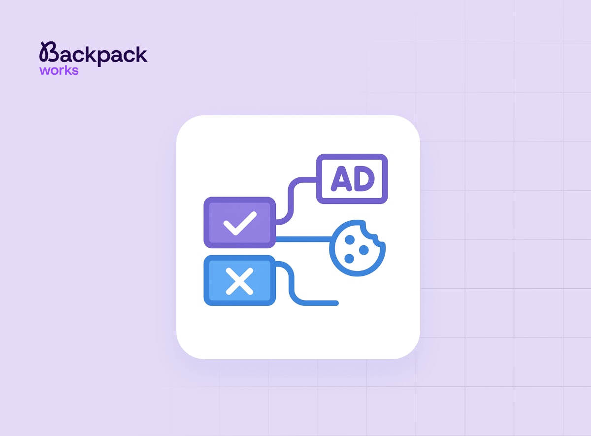
Opt-in vs. Opt-out: The Data Collection and Google Ads Conversion
A practical guide to data collection and boosting conversion using Google Ads.
Gabriel Pelc
•2026-03-27
Conversion-Focused Web Design Principles for 2026
Discover how conversion focused web design principles improves B2B growth performance. Tactical strategies, implementation frameworks, and measurable ROI insights.
Daniel Murillo
•2025-12-16
Core Web Vitals: How Performance Affects Conversions
Discover how Google’s Core Web Vitals measure real user experience. See why optimizing for speed, responsiveness, and stability is essential for higher rankings and lower bounce rates.
Letícia Caldeirão
•2025-12-10
Opt-in vs. Opt-out: The Data Collection and Google Ads Conversion
A practical guide to data collection and boosting conversion using Google Ads.